


GALLEON HOLDINGS
Logo Design & Brand Identity Design -// 2021
About Galleon
Galleon is a prominent global holdings company dedicated to revolutionizing various sectors and ensuring exceptional products and services. With a diverse portfolio encompassing commercial kitchens, e-commerce, and shipping solutions, real estate development, and a range of legal & financial services companies, Galleon stands at the forefront of innovation and excellence.
The mission is clear – to provide top-notch quality across industries and deliver transformative solutions that drive success for businesses worldwide. They recognize that each sector requires specialized expertise, so they have strategically acquired companies with deep knowledge and experience in their respective fields.
Galleon is driven by the desire to touch more lives and make a positive impact on a global scale. As They expand their reach, they seek to connect with individuals and businesses, offering them the opportunity to benefit from the extensive expertise and resources. Their dedication to providing quality services knows no boundaries, and they are excited to embark on new ventures and collaborations that drive them toward greater heights.
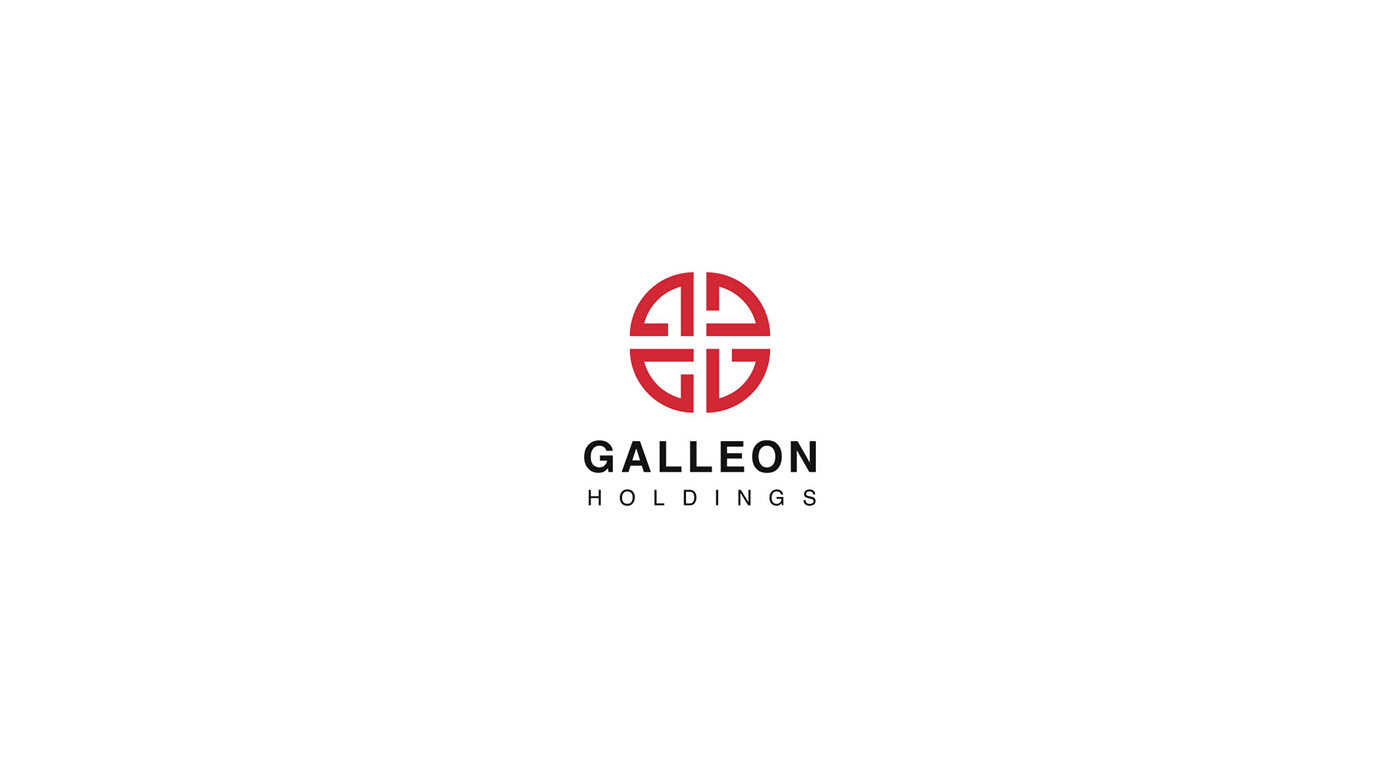

Galleon Logo
A logo is the face of a company, so it is necessary to make a unique and professional logo to stand out from the crowd. This is a modern and unique logo that is designed based on the nature of the company. As the client wanted the logo to have a Corporate, Powerful, Authoritative, and Prestigious look I had to make something that's bold and eye-catching. This is the logo I came up with. It has two different styles and is very responsive one.

Logo Grid
A logo grid, also known as a logo construction grid, is a fundamental tool used by designers to create visually balanced and harmonious logos. The primary purpose of a logo grid is to establish consistent proportions and spatial relationships between different elements within the logo. It ensures that the logo maintains a sense of balance, coherence, and visual stability. In this logo, a logo grid was used to make sure the logo is geometrically balanced and perfectly proportioned.

Logo Mark
The logo mark had to be unique and professional. The logo mark has four different shapes, to be more specific it has four letter 'G' abstract marks in different angles and directions. It represents the first letter of the name of the company and the versatile services of the company. Multiple letter 'G's stand for multiple services. All these qualities make it a perfect logo for the holding company.
The logo mark had to be unique and professional. The logo mark has four different shapes, to be more specific it has four letter 'G' abstract marks in different angles and directions. It represents the first letter of the name of the company and the versatile services of the company. Multiple letter 'G's stand for multiple services. All these qualities make it a perfect logo for the holding company.

Brand Color Palette
A brand color palette refers to a set of carefully selected colors that are associated with a particular brand or organization. These colors play a crucial role in defining and representing the brand's identity, personality, and visual communication strategy. These specific colors were chosen for this brand to make sure the brand has a consistent tone in all of its branded materials.

Branded Stationery
As a holding company, they need some branded stationery as well. So we decided to make some stationery designs with the branded elements to make sure the brand is utilizing its branded elements properly. Here are some mockups to showcase the real-life view of some stationery designs.


Project Completed: September 2021
Client: Galleon Holdings
Project Scope: Logo & Brand Identity Design
Designer: Maruf Ahmed
Role: Logo Designer - Brand Identity Designer
Contact for your project - contact@marufiam.com
Website - www.marufiam.com
Get mockups here: MockupCloud
Thank You
Marufiam


